Matt Ep. 2 - Blender/Pro builder Modelling, Environment, Main Menu + Dotween
Written by Matt Koopman of TDM Productions:
One of the tasks I ended up taking on was Modelling, as I felt quite comfortable with my development skills, and wanted to take a crack at something which I was not very experienced with.
When I look back on where our environment and setting is now, it is crazy to think that we started with the idea of it just being some basic suburban town. With very little experience doing modelling, I set out for my first task, which was to make a neighbourhood, and my first task. Around this time, we were still uncertain what the story subtext would be, and so I spent about a day making a decent-enough house model, and then it was on to the road…
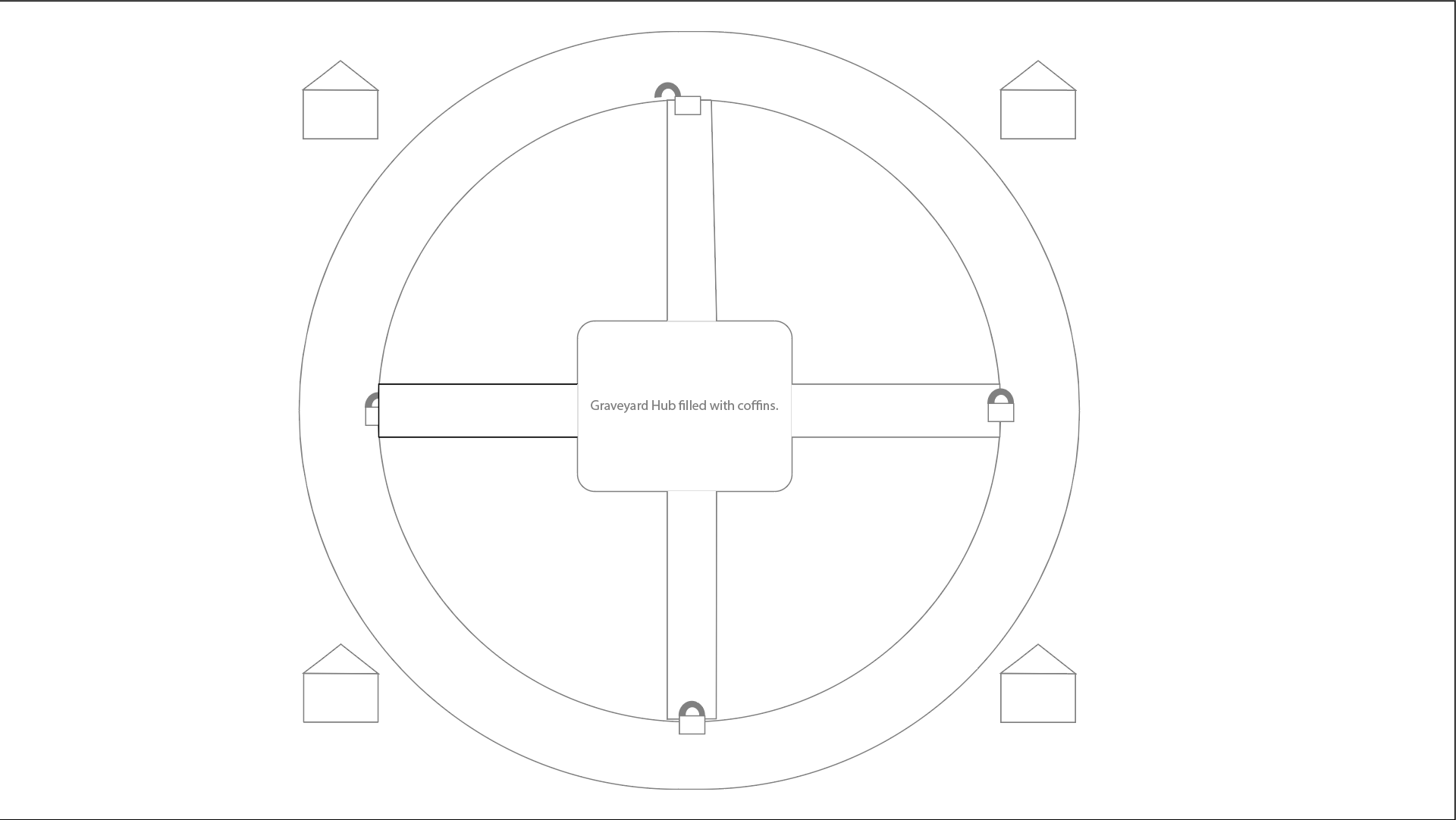
We had a cool idea for the shape of the map so it would have a suburban ring-road type feel, and Tyler’s map helped me to do that. I exported this map as a jpg, and overlayed it on the plane so I could make a ring road type design based on Tyler’s level design map:

The road, which seemed the simplest, was actually the hardest for a couple reasons. Scaling was tough to decide on. I would make a decent enough shape, and then it would be too large once testing a player controller within it’s bounds. Then I would need to add a sidewalk of proportional size. Without formal training, I found interesting ways to work to make it look decent, but it was tricky. The importance of making sure you understand where your vertexes are and where the edges are going became very clear once I couldn’t move my player through an invisible vertex which blocked the edges of the sidewalk.
Once I started working on the trees and terrain elements, it became clear that our own surroundings (BC, Canada, Pacific Northwest), would serve as excellent inspiration for our setting. We scrapped the idea of its being suburban - having a lot of houses, meant a lot of modelling, and with us being primarily developpers, we decided that not only would the setting of ‘remote house in the woods of BC’ be a unique and and complimentary setting for our Horror vibe, but would also be a LOT less individual modelling.
I spent a solid week of creating the environment, with textured mountains, coastal water, a moon, night sky, and a whole BUNCH of trees, we had a beautiful nature environment! My early prototypes included adding sound fx and tweaking certain elements to test how the game’s mood would be. The guys loved it, and so did I.
I was tasked with the Main Menu, and when it was time to decide what it would look like, we all agreed together that using the beautiful nature and tree environment would be an excellent way to highlight a key feature of the isolated, terrifying feeling of the remote forest woods.
So with that, I used my favourite unity asset on planet earth to design a system to animate the camera with Dotween functions. I always found it easier to make sense of animation patterns with Dotween than with Unity’s Animator. So I created a camera animation that showcased the mountains and the coastline transitioning into the trees. Making the title, I used a lot more Dotween with the shaders to animate float values for that sparkle and dazzle!
I then (as I naturally always do), needed to add music and sfx to make it feel complete. I added a custom made score to build the intensity, and did more automating of values to add transitions that felt cool and responsive. I love the sound that I added when the player presses any key.
A lot of the development of UI felt very natural to me, so I was able to create a lot of sparkle in between all of the more functional code based aspects. I love my little live-cutscene things that give a chilling vibe to the game
I feel that the main menu that players land on is a ig part of setting the mood, and I think I did a great job of that. One of the biggest parts of creating that mood was the lighting, and while I was tweaking with it, and when I was tasked with creating the Round and Game Managers, I had a great idea for how the aspect of Day and Night would lend itself to our genre, our mood, and to the functional aspect of the game. It ended up being a major feature of the game, and I am excited to describe it in more detail in the next episode!
Get Sanguine Falls
Sanguine Falls
Atmospheric FPS with a Night/Day cycle for killing rounds of vampires in a coastal forest town.
| Status | Prototype |
| Authors | TDMProductions, Saje, Adequate guy |
| Genre | Survival, Shooter |
| Tags | Atmospheric, Creepy, daynightcycle, First-Person, Horror, roundbased, Singleplayer, Unity |
More posts
- Build 0.1.4 - Sensitivity Bar addedJan 15, 2024
- Matt Ep. 5 - Finishing touches, polish, details, fxJan 12, 2024
- Matt Ep. 3 - Day/Night Cycle, Round Management, Game FlowJan 12, 2024
- Matt Ep. 4 - AudioManager, SFX, MusicJan 12, 2024
- PlayerController/HealthJan 11, 2024
- Projectile LogicJan 11, 2024
- Shooting FunctionalityJan 11, 2024
- Matt Ep. 1 - Planning, Vision, MVPJan 06, 2024
- Pause MenuJan 03, 2024
Leave a comment
Log in with itch.io to leave a comment.